BarChart
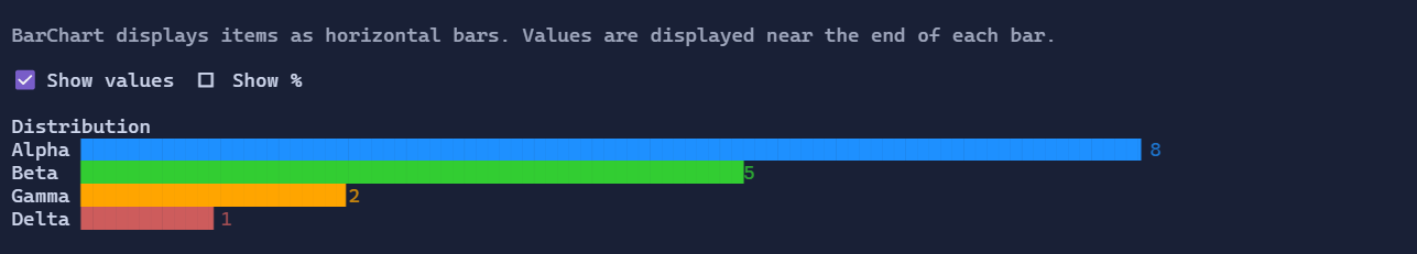
BarChart renders a horizontal bar chart with a label column and a bar column. When enabled, the value text is
rendered near the end of the filled portion of each bar (instead of being flush-right at the end of the chart).
Basic usage
var chart = new BarChart()
    .Title("Distribution")
    .Minimum(0)
    .Maximum(10)
    .ShowValues(true)
    .ShowPercentages(false)
    .Items(
        new BarChartItem("Alpha", 8),
        new BarChartItem("Beta", 5),
        new BarChartItem("Gamma", 2),
        new BarChartItem("Delta", 1));
Items
Items are stored in BarChart.Items as BarChartItem objects:
BarChartItem.Label: a visual displayed in the left column (you can use"Text",Markup, anHStackwith an icon, etc.).BarChartItem.Value: numeric value used to compute bar fill.BarChartItem.ValueLabel: optional explicit value label visual. When set, it is positioned near the end of the bar.BarChartItem.BarColor: optional bar color override.
Range
By default, the chart derives bounds from items (Minimum = 0, Maximum = max(item.Value)). You can override this via:
BarChart.MinimumBarChart.Maximum
Defaults
- Default alignment:
HorizontalAlignment = Align.Stretch,VerticalAlignment = Align.Start - On bounded layouts, the chart keeps an intrinsic minimum width and uses the offered width as its natural size, so it can live inside star/flex grid columns without forcing them wider.
Styling
The chart is styled via BarChartStyle:
Padding: padding around the grid.RowSpacing: spacing between rows.BarStyle: progress bar style used for each bar row.DefaultBarColors: optional palette used when items do not provideBarColor.
BarChartStyle.ValueTextStyle can be used to customize the default value text (when BarChartItem.ValueLabel is not set).