BreakdownChart
BreakdownChart renders a segmented proportional bar (a “breakdown”) with an optional legend. It is useful for showing how
a total value is distributed across categories (disk usage, budgets, KPIs, resource usage, etc.).
Basic usage
var breakdown = new BreakdownChart()
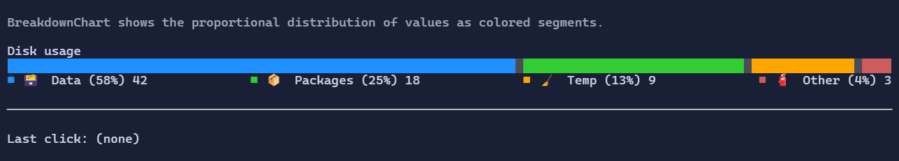
.Title("Disk usage")
.ShowValues(true)
.ShowPercentages(true)
.Segment(42, "🗃️ Data", tooltip: new Markup("[primary]Data[/] files and databases."))
.Segment(18, "📦 Packages", tooltip: new Markup("[success]Packages[/] in the cache."))
.Segment(9, "🧹 Temp", tooltip: new Markup("[warning]Temporary[/] files."))
.Segment(3, "🧯 Other", tooltip: new Markup("[error]Other[/] space usage."));
Segments
Segments are stored in BreakdownChart.Segments as BreakdownSegment objects.
BreakdownSegment.Value: numeric value used to compute proportions.BreakdownSegment.Label: a visual shown in the legend (use aTextBlock,Markup, anHStackwith an icon, etc.).BreakdownSegment.Color: optional segment fill color; when not provided, the control cycles through theme tones.BreakdownSegment.Tooltip: optional tooltip content shown when hovering the segment in the bar.
For convenience, you can append segments fluently using BreakdownChartExtensions.Segment(...) as shown above.
Interaction
BreakdownChart raises a routed SegmentClicked event when the user clicks a segment:
breakdown.SegmentClicked((_, e) =>
{
    Terminal.WriteLine($"Clicked segment {e.Index}: {e.Segment.Value}");
});
Layout
BreakdownChart.Title: optional title shown above the bar.BreakdownChart.LegendPlacement:AboveorBelow(default:Below).BreakdownChart.ShowValues/BreakdownChart.ShowPercentages: controls legend value display.
Defaults
- Default alignment:
HorizontalAlignment = Align.Stretch,VerticalAlignment = Align.Start
Styling
BreakdownChart is styled via BreakdownStyle:
FillRune: rune used to fill the bar (default is a space with colored backgrounds).SegmentGap: number of empty cells between segments.LegendLayout: compact (wrap) or expanded (one item per line).LegendItemSpacing: spacing between legend items when using the compact layout.LegendJustify: how leftover space is distributed along each compact legend line.BarStyle: optional base style applied to bar cells.DefaultSegmentColors: optional palette used when a segment does not provide an explicitColor.
Example:
breakdown.Style(new BreakdownStyle
{
    SegmentGap = 0,
});