Button
Button is a clickable control that renders a label/content and raises a click interaction via a routed event.
Basic usage
new Button("Click me")
    .Click(() => Terminal.WriteLine("Clicked"));
Content
Buttons are content controls. The content can be any Visual:
new Button().Content(new HStack("Save", new Spinner()))
Interaction
- Keyboard: typically activated with Enter/Space when focused.
- Mouse: click/press/release is tracked; mouse capture prevents hover/press from “leaking” to other controls.
Defaults
- Default alignment:
HorizontalAlignment = Align.Start,VerticalAlignment = Align.Start
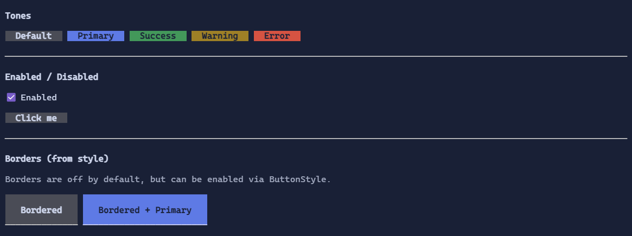
Styling
Use ButtonStyle to control:
- tone (default/primary/success/warning/error)
- padding
- background/foreground for normal/hover/pressed/disabled
- optional decorative border glyphs (Button keeps a custom border because it has a specialized rendering)
new Button("Danger")
    .Style(ButtonStyle.Default with { Tone = ControlTone.Error });
See also: