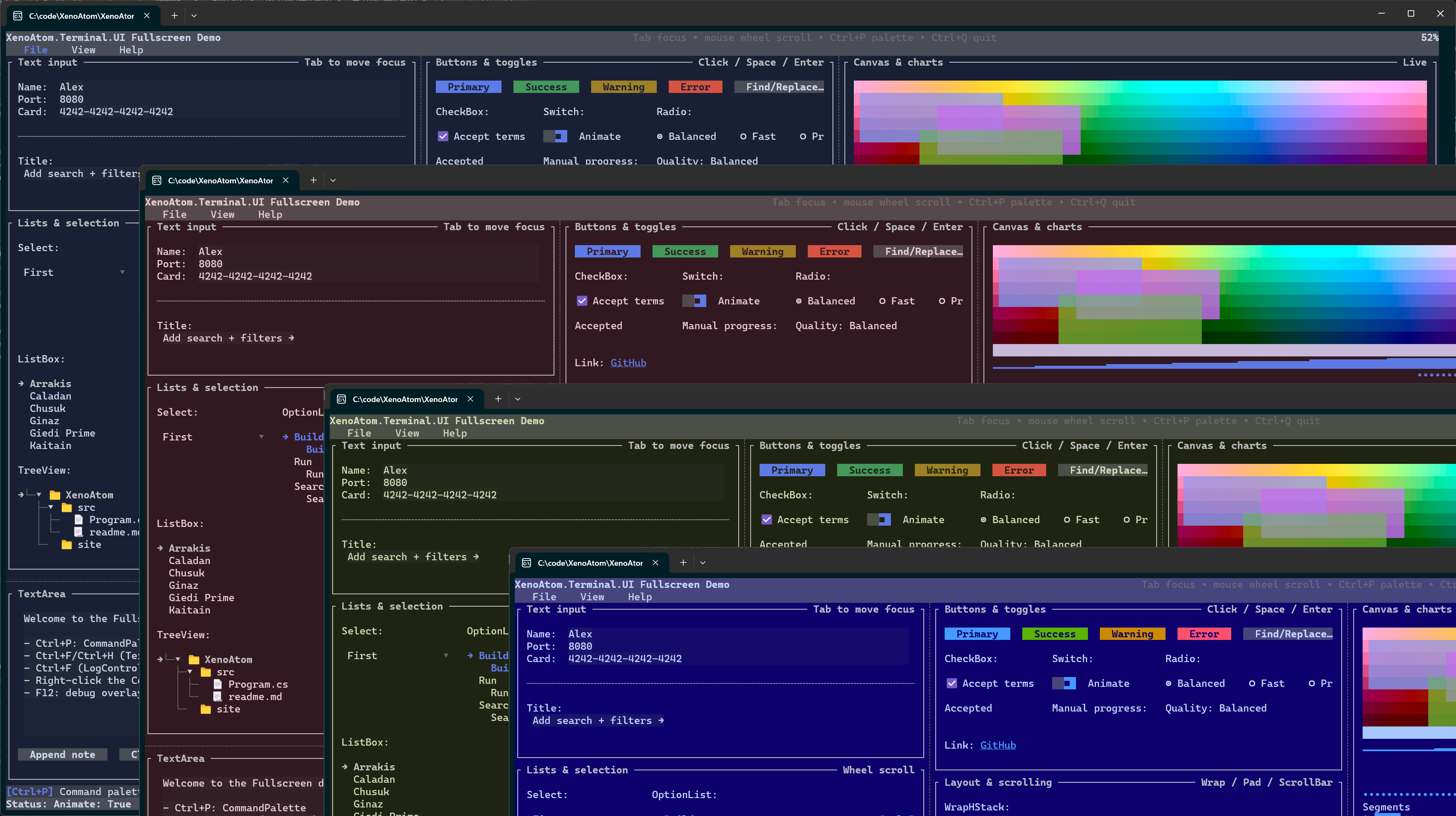
Styling & Themes
XenoAtom.Terminal.UI uses a theme/style model built on ANSI colors and cell styling.
Theme
Theme is a set of style values used as the default environment for visuals.
- Fullscreen apps typically use
Theme.Default(RGB scheme). - Inline/live widgets typically use
Theme.Terminal(uses terminal default colors).
Themes are resolved from the environment (Visual.GetTheme()), and can be overridden per subtree.
Applying a theme
using XenoAtom.Terminal.UI.Controls;
using XenoAtom.Terminal.UI.Styling;

var themed = new Group(new TextArea("Themed region"))
    .Style(Theme.FromScheme(ColorScheme.CherryDark));
What a Theme contains
Theme is intentionally “semantic”: controls mostly consume design tokens such as:
Surface,PopupSurface: background surfacesControlFill,ControlFillHover,ControlFillPressed: button-like fillsInputFill,InputFillFocused: text input surfacesBorder,FocusBorder: stroke colorsAccent,Selection: key interaction colors
In dark RGB themes, PopupSurface is intentionally closer to the app background than the older lifted-panel treatment so dialogs and popups do not feel washed out.
For RGB schemes, many tokens are derived using subtle alpha overlays. This is how the default theme achieves “lifted” panels and soft hover effects without hard-coded colors.
Styles
Controls obtain their styles from the environment:
new Button("OK").Style(new ButtonStyle { Tone = ControlTone.Primary })
Styles can also be resolved dynamically from a factory (dependency-tracked):
var danger = new State<bool>(false);

new Button("Deploy")
    .Style(() => danger.Value
        ? (ButtonStyle.Default with { ShowBorder = true })
        : ButtonStyle.Default);
And styles can come from a binding:
var buttonStyle = new State<ButtonStyle>(ButtonStyle.Default);

new Button("Apply").Style(buttonStyle);
Style resolution follows normal environment lookup rules: nearest visual with a local value wins.
Values set by Style(...), SetStyle(...), factories, and bindings all participate in this lookup.
Styles are records, so variations can be created with with:
var danger = ButtonStyle.Default with { Tone = ControlTone.Error };
Brushes and gradients
Brushes provide per-cell gradient colors while keeping the core Style representation compact.
Supported brush kinds:
Brush.Solid(...)Brush.LinearGradient(...)
Controls with direct brush support:
TextBlockStyle.ForegroundBrush/TextBlockStyle.BackgroundBrushTextFigletStyle.ForegroundBrush/TextFigletStyle.BackgroundBrushTextBoxStyle.ForegroundBrush/TextBoxStyle.BackgroundBrush
Example:
var brush = Brush.LinearGradient(
    new GradientPoint(0f, 0f),
    new GradientPoint(1f, 0f),
    [new GradientStop(0f, Colors.DeepSkyBlue), new GradientStop(1f, Colors.White)]);

new TextBlock("Gradient text")
    .Style(TextBlockStyle.Default with { ForegroundBrush = brush });
The default interpolation space comes from Theme.GradientMixSpace (default ColorMixSpace.Oklab).
Set mixSpaceOverride on a brush when a specific interpolation mode is required.
Color schemes
ColorScheme represents a 16-color scheme.
Schemes can be:
- terminal-indexed (
Color.Basic16(...)) - RGB (
Color.Rgb(...)/Color.RgbA(...))
Root Loops schemes (built-in + generator)
XenoAtom.Terminal.UI ships with a set of curated color schemes generated with Root Loops:
- Website: https://rootloops.sh by Ham Vocke
- Generator code:
ColorScheme.Generate(...) - Predefined schemes:
ColorScheme.GetPredefinedSchemes()
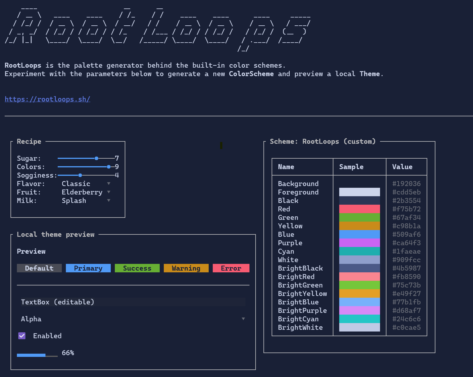
Theme.Default and Theme.DefaultLight are built from:
ColorScheme.RootLoopsDarkColorScheme.RootLoopsLight
You can list all built-in schemes (for example in a demo):
var schemes = ColorScheme.GetPredefinedSchemes();
Alpha blending (RGBA)
XenoAtom.Terminal.UI supports alpha-aware colors via Color.RgbA(r,g,b,a).
Even though the terminal ultimately renders a single color per cell, alpha colors are blended during rendering so
overlays and lifted surfaces look consistent.
Guidance:
- Use low alpha for hover/focus overlays (e.g.
0x10to0x40). - Prefer themes for most colors; use raw RGB(A) for special-purpose visuals.
Glyphs
Rendering glyphs (borders, scrollbars, etc.) are stored in styles using Rune so controls can be re-themed without changing behavior.
See also: