CheckBox
CheckBox is a two-state toggle control (checked/unchecked) with a label/content.
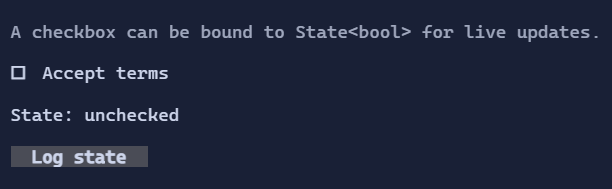
Basic usage
var accepted = new State<bool>(false);

new CheckBox("Accept terms")
    .IsChecked(accepted);
To react imperatively when the value changes, use the routed ValueChanged event:
new CheckBox("Accept terms")
    .ValueChanged((_, e) => Console.WriteLine($"Checked: {e.NewValue}"));
Content & spacing
The label can be a Visual, and spacing between glyph and label is controlled by CheckBoxStyle.
Interaction
Space/Enter: toggle when focused.- Mouse click: toggle.
ValueChanged: raised whenIsCheckedchanges.
Defaults
- Default alignment:
HorizontalAlignment = Align.Start,VerticalAlignment = Align.Start
Styling
CheckBoxStyle controls glyphs, spacing, and colors for normal/hover/focused/disabled states.