ScrollViewer
ScrollViewer provides a viewport with optional horizontal/vertical scrollbars for any content.
Basic usage
new ScrollViewer(new VStack(
    "Line 1",
    "Line 2",
    "Line 3"
));
ScrollViewer is typically used as the outer container around long content:
new Border(
    new ScrollViewer(new TextArea("... lots of text ..."))
        .MinHeight(8)
        .MaxHeight(8));
Content implementing IScrollable
If Content implements IScrollable, ScrollViewer delegates scrolling to the content’s ScrollModel.
This enables controls like TextArea to own their own extent and viewport logic.
If Content does not implement IScrollable, ScrollViewer provides an internal scroll model and performs
viewport clipping/offsetting automatically.
IScrollable is the recommended contract for any control that has intrinsic scrolling behavior
(text editors, virtualized lists/grids). It allows:
- consistent scrollbar behavior,
- keyboard + wheel scrolling support,
- nested scroll composition without guessing content size.
Interaction
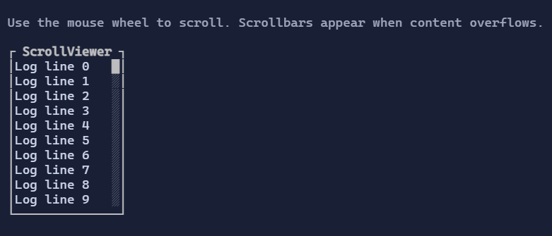
- Mouse wheel scrolls the closest
ScrollViewerunder the pointer. Shift + wheel(when supported by the host) scrolls horizontally.- Scrollbars can be clicked to jump to a position or dragged continuously; they can be focused for keyboard interaction.
Layout behavior (viewport vs extent)
ScrollViewer distinguishes:
- Viewport: how much space is currently available to display content.
- Extent: how large the scrollable content is (in terminal cells).
When the extent exceeds the viewport, ScrollViewer:
- clamps scroll offsets,
- displays the relevant scrollbars (when enabled),
- reserves space for the scrollbars so content does not render under them.
If you expect scrollbars to appear, prefer bounding one axis (MinHeight/MaxHeight or MinWidth/MaxWidth)
so the control has a reason to clip and scroll.
Defaults
- Default alignment:
HorizontalAlignment = Align.Stretch,VerticalAlignment = Align.Stretch
Styling
ScrollViewerStyle controls scrollbar thickness and color palette.
ScrollBarStyle controls track/thumb colors and glyphs.