TabControl
TabControl hosts multiple tab pages with clickable headers.
Tab headers are visuals, enabling rich header content (icons, counters, dynamic text, etc.).
TabPage is now a bindable model, so you can update a page's Header, Content, IsEnabled, ShowCloseButton, or Data
without removing and recreating the tab.
Basic usage
var logs = new TabPage("Logs", "Tail -f output")
{
    ShowCloseButton = true,
    Data = "logs",
};

logs.RequestClosing += (_, e) =>
{
    if (HasPendingSave())
    {
        e.Cancel = true;
    }
};

var tabs = new TabControl(
    new TabPage("Status", "Ready"),
    logs,
    new TabPage("Metrics", "42 req/s") { ShowCloseButton = true });
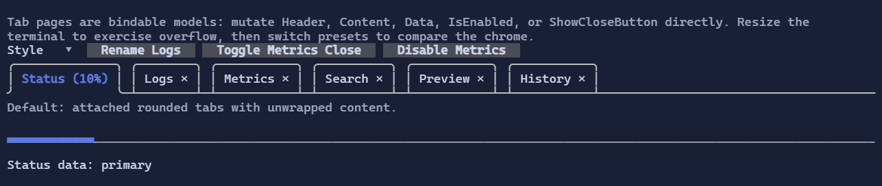
Defaults
- Default alignment:
HorizontalAlignment = Align.Stretch,VerticalAlignment = Align.Stretch - The default style renders attached rounded tabs over a separator line instead of boxing the selected content.
- Tab headers stay on a single line. When they do not fit, overflow buttons appear at the far left and far right.
Tab pages
TabPage exposes bindable state:
Header : VisualContent : VisualIsEnabled : boolShowCloseButton : boolData : object?
Close lifecycle:
RequestClosinglets a page cancel a close request.Closedis raised after the page has been removed.TabControl.TryCloseTab(...)closes a page programmatically and uses the same lifecycle as the close button.
Styling
TabControlStyle controls header rendering, close buttons, overflow buttons, separator/frame glyphs, and the optional content wrapper.
By default:
- selected tabs use accent/focus styling on the attached tab header
- close buttons inherit the tab style, then switch to an error-toned hover/pressed state
- overflow buttons use the tab/button surface styling
- the selected content is not wrapped in an extra border
Use TabControlStyle.Compact for a tighter single-line attached look, or TabControlStyle.Legacy to restore the original flat strip + boxed content layout.
new TabControl(
    new TabPage("Status", "Ready"),
    new TabPage("Logs", "…") { ShowCloseButton = true })
    .Style(TabControlStyle.Default with
    {
        CloseButtonRune = new Rune('x'),
        OverflowPreviousRune = new Rune('<'),
        OverflowNextRune = new Rune('>'),
    });

new TabControl(
    new TabPage("Status", "Ready"),
    new TabPage("Logs", "…"))
    .Style(TabControlStyle.Compact);

new TabControl(
    new TabPage("Status", "Ready"),
    new TabPage("Logs", "…"))
    .Style(TabControlStyle.Legacy);
Interaction
- Mouse click on a tab header activates the tab.
- Clicking a close button requests tab closure and may be cancelled by the page.
- When tabs overflow, left/right overflow buttons scroll the visible header window.
Left/Rightarrow keys switch between enabled tabs when the control is focused.