TextBlock
TextBlock renders read-only text with optional wrapping, alignment, and trimming.
Basic usage
new TextBlock("Hello, world!");
Dynamic text (bindings)
TextBlock supports a dynamic text provider via a Func<string>:
var count = new State<int>(0);

new TextBlock(() => $"Count: {count.Value}");
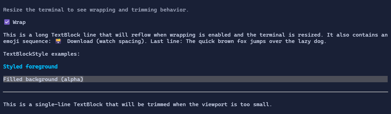
Wrapping and trimming
new TextBlock("This is a long line that can wrap.")
    .Wrap(true);

new TextBlock("This is a long single line that will be trimmed.")
    .Wrap(false)
    .Trimming(TextTrimming.EndEllipsis);
When Wrap is false, TextBlock can shrink horizontally during layout, so it works well in patterns such as
Grid(Star + Auto) where trailing actions should remain visible while the text trims.
Alignment
TextAlignment controls how the text is aligned inside the available width:
new TextBlock("Centered")
    .TextAlignment(TextAlignment.Center)
    .HorizontalAlignment(Align.Stretch);
Defaults
- Default alignment:
HorizontalAlignment = Align.Start,VerticalAlignment = Align.Start
Selection and copy
TextBlock supports mouse selection:
- drag with the left mouse button to select a range
- double-click to select a word
Ctrl+Ccopies the active selection
Selection is enabled by default. Set IsSelectable = false to opt out.
Styling
Use TextBlockStyle to override colors and decorations for a subtree (or for a single TextBlock):
new TextBlock("Accent")
    .Style(TextBlockStyle.Default with
    {
        Foreground = Colors.DeepSkyBlue,
        TextStyle = TextStyle.Bold,
    });
To apply a background only behind the glyphs, set Background:
new TextBlock("Highlighted")
    .Style(TextBlockStyle.Default with
    {
        Background = Colors.Blue,
        Foreground = Colors.White,
    });
To fill the whole bounds with a background, enable FillBackground:
new TextBlock("Banner")
    .HorizontalAlignment(Align.Stretch)
    .Style(TextBlockStyle.Default with
    {
        Background = Colors.Blue,
        Foreground = Colors.White,
        FillBackground = true,
    });
To use gradients, set ForegroundBrush and/or BackgroundBrush:
new TextBlock("Gradient title")
    .HorizontalAlignment(Align.Stretch)
    .Style(TextBlockStyle.Default with
    {
        ForegroundBrush = Brush.LinearGradient(
            new GradientPoint(0f, 0f),
            new GradientPoint(1f, 0f),
            [new GradientStop(0f, Colors.DeepSkyBlue), new GradientStop(1f, Colors.White)]),
        BackgroundBrush = Brush.LinearGradient(
            new GradientPoint(0f, 0f),
            new GradientPoint(1f, 0f),
            [new GradientStop(0f, Color.Rgb(0x1D, 0x3F, 0x62)), new GradientStop(1f, Color.Rgb(0x12, 0x20, 0x33))]),
        FillBackground = true,
    });