TreeView
TreeView displays hierarchical nodes with expand/collapse interaction and selection.
Basic usage
var root = new TreeNode("Root") { IsExpanded = true };
root.Children.Add(new TreeNode("Child A"));
root.Children.Add(new TreeNode("Child B"));

new TreeView()
    .Roots([root]);
Interaction
- Arrow keys move selection and expand/collapse nodes (when supported by the current node).
- Mouse click selects a row; glyph areas allow expanding/collapsing.
SelectedIndexis the index in the current flattened list of visible rows, not an index withinRootsor within a parent node'sChildren.- The flattened list contains only nodes that are currently visible after applying expansion/collapse state.
- Because of that,
SelectedIndexcan change meaning when nodes are expanded or collapsed. It is mainly useful for keyboard navigation and scroll positioning. SelectedNodeexposes the selectedTreeNodedirectly, so application code does not need to map the index back to a node.TrySelectNode(node)selects a visible node by reference.
Selection example
var root = new TreeNode("Root") { IsExpanded = true, Data = "Root" };
var child = new TreeNode("Child") { Data = "Child" };
root.Children.Add(child);

var tree = new TreeView([root]);

tree.TrySelectNode(child);
var selectedNode = tree.SelectedNode;
var selectedLabel = selectedNode?.Data as string;
If the visible rows are:
0 Root
1 Child
2 Other
then SelectedIndex == 1 means Child is selected. If Root is collapsed, the visible rows become:
0 Root
1 Other
and SelectedIndex == 1 now refers to Other. For application logic, prefer SelectedNode.
Defaults
- Default alignment:
HorizontalAlignment = Align.Stretch,VerticalAlignment = Align.Stretch
Node visuals
Nodes can use glyphs/icons (e.g. folder/file) and are composable visuals.
Each node is represented by a TreeNode:
Headeris aVisual(anything can be used: text, markup, composed layouts).Childrenis a bindable list of nodes.IsExpandedcontrols whether children are visible.Iconcontrols the glyph rendered before the header.IconStylelets you style that icon directly (for example with a custom foreground color).
var logs = new TreeNode("Logs")
{
    Icon = TreeNodeIcons.FolderGlyph,
    IconStyle = Style.None.WithForeground(Colors.Goldenrod),
};
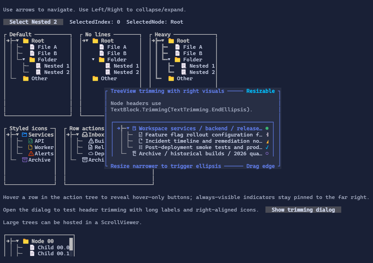
Right-aligned row visuals
Each TreeNode can also expose visuals pinned to the right edge of the row.
These can be status indicators, one-cell action buttons, counters, or any other Visual.
- Use
RightVisualsfor direct collection access. - Use
AddRightVisual(...)for a fluent setup. TreeNodeRightVisualVisibility.Alwayskeeps the visual visible whenever the node row is visible.TreeNodeRightVisualVisibility.Hovershows the visual only while the row is hovered.- When both modes are present, always-visible visuals stay on the far right and hover-only visuals appear immediately to their left.
var compactButtonStyle = ButtonStyle.Default with { Padding = Thickness.Zero };

var node = new TreeNode("Build pipeline")
    .AddRightVisual(
        "!",
        TreeNodeRightVisualVisibility.Always)
    .AddRightVisual(
        new Button("x")
            .Style(compactButtonStyle)
            .Tone(ControlTone.Error)
            .Click(() => Console.WriteLine("Dismissed"))
            .Margin(new Thickness(1, 0, 0, 0)),
        TreeNodeRightVisualVisibility.Hover);
Spacing is controlled by the visuals themselves, so margins work well for separating stacked indicators and actions.
If a node header is a text visual such as TextBlock, Markup, or Paragraph, trimming now works against the visible
space left before the right-aligned visual group. This makes patterns like a long label plus trailing status glyphs work
as expected:
var node = new TreeNode(
        new TextBlock("Release candidate build pipeline for production")
        {
            Trimming = TextTrimming.EndEllipsis,
        })
    {
        Icon = TreeNodeIcons.FileGlyph,
    }
    .AddRightVisual("●");
When the row becomes narrower, the header trims before the trailing visual instead of drawing underneath it.
Styling
TreeViewStyle controls indentation, glyphs, spacing, selection colors, and a default IconStyle.