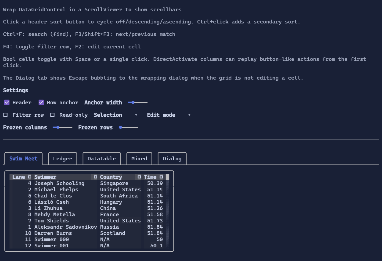
DataGridControl
DataGridControl is an interactive, virtualized, data-bound table control intended for large datasets and rich interaction:
scrolling, selection, sorting, searching/filtering, column resizing, and inline editing.
The lower-level contracts and data model live in DataGrid Specs.
Quick start
Typical usage is:
- create an
IDataGridDocument(e.g.DataGridListDocument<T>orDataGridDataTableDocument), - wrap it in a view (
DataGridDocumentView) when you want sorting/filtering/search, - bind it to
DataGridControl.View, - wrap the grid in a
ScrollViewerto show scrollbars.
You can bind DataGridControl.Document directly for the simplest scenario, but using a view is the recommended path
when you want projection (sort/filter) and when the source can change shape.
Example
using XenoAtom.Terminal.UI;
using XenoAtom.Terminal.UI.Controls;
using XenoAtom.Terminal.UI.DataGrid;

public sealed partial class MyRow
{
    [Bindable] public partial int Id { get; set; }
    [Bindable] public partial string Name { get; set; } = string.Empty;
}

var doc = new DataGridListDocument<MyRow>()
    .AddColumn(MyRow.Accessor.Id)
    .AddColumn(MyRow.Accessor.Name);

using var view = new DataGridDocumentView(doc);

var grid = new DataGridControl { View = view, FrozenColumns = 1 };

// Optional: provide typed UI columns to enable typed templates/editors and per-column overrides.
grid.Columns.Add(new DataGridColumn<int>
{
    Key = MyRow.Accessor.Id.Name,
    TypedValueAccessor = MyRow.Accessor.Id,
    Width = GridLength.Auto,
    CellAlignment = TextAlignment.Right,
    Sortable = true,
});

grid.Columns.Add(new DataGridColumn<string>
{
    Key = MyRow.Accessor.Name.Name,
    TypedValueAccessor = MyRow.Accessor.Name,
    Width = GridLength.Star(1),
    Sortable = true,
});

var root = new ScrollViewer(grid);
Documents, views, and schema-driven columns
DataGridControl renders columns from the current snapshot:
- A document produces a snapshot (
IDataGridDocumentSnapshot) that describes columns + rows. - A view (
IDataGridView) projects a document (filtering/sorting), and exposesCurrentSnapshot. - The control resolves visible columns either from:
- the schema snapshot (
grid.Columns.Count == 0), or - the UI column collection (
grid.Columns) if you want per-column customization.
- the schema snapshot (
Schema-only mode supports selection, scrolling, search, filtering, and column resizing.
Add grid.Columns when you need typed templates/editors, custom header visuals, or per-column constraints.
Column sizing and resizing
Sizing rules are intentionally simple:
Auto: uses header width and a content sample (virtualized).Fixed: uses the given width.Star: participates in filling remaining space.
You can resize columns at runtime:
- Drag the separator between columns to set a fixed width.
- Double-click the separator to auto-size to the max content width (header + all rows).
Auto-size scans the entire column. For very large datasets, prefer AutoSizeSampleRowCount-style sizing
(the default auto sizing) and use auto-size on demand.
Sorting
Sorting is opt-in per UI column:
- set
DataGridColumn.Sortable = trueto show the header sort button, - optionally set
DataGridColumn<T>.SortComparerto override the defaultComparer<T>.Default, - click the header sort button to cycle
None -> Descending -> Ascending -> None, Ctrl+clickadds/removes secondary sorts so multi-column sorts are additive and stable (Alt+clickis also accepted).
You can also sort programmatically:
grid.TrySetColumnSortDirection(MyRow.Accessor.Name.Name, DataGridSortDirection.Ascending);
grid.TrySetColumnSortDirection(MyRow.Accessor.Id.Name, DataGridSortDirection.Descending, additive: true);
When the view is a DataGridDocumentView, any configured SortComparer is forwarded automatically.
Input
Ctrl+F: open find UI (usesSearchReplacePopupin find mode)F3/Shift+F3: next / previous matchF4: toggle filter row (whenViewis filterable)- click header sort button: toggle sort (
Ctrl+clickfor additive multi-sort;Alt+clickalso works) - Arrow keys / PageUp / PageDown: navigate the current cell
F2orEnter: edit current cell (when editable)- bool cells toggle on
Space,Enter, or a single click without staying in edit mode - columns configured with
DataGridColumn.CellActivationMode = DataGridCellActivationMode.DirectActivatecan replay button-like actions from the first key press or click
Selection, copy, and clipboard
DataGridControl supports:
- cell selection (default) and row selection (via row anchor),
Ctrl+Ato select the entire table,Ctrl+Cto copy the current selection.
The copied format is plain text designed to paste into editors/spreadsheets (tab-separated values).
Editing
Editing is enabled when:
ReadOnly == false, and- the schema column is not read-only (or the UI column explicitly overrides).
When editing starts, the control chooses an editor:
TextBoxfor strings (supports selection, scrolling inside the cell, copy/paste, undo/redo),NumberBoxfor numeric types,- boolean and enum columns use type-appropriate editors when a typed UI column is provided.
Cell activation defaults to a hybrid model:
- text-style editors stay in explicit edit mode (
F2,Enter, second click, or double-click), - bool cells activate directly,
- custom action cells can opt in per column with
CellActivationMode = DataGridCellActivationMode.DirectActivate.
When the grid is focused but no cell editor is active, Esc now falls through normally, so wrapping dialogs can bind their
own Escape shortcut without the grid reserving it.
If you need a custom cell editor or display, provide a typed DataGridColumn<T> and use templates.
See Data Templating.
Notes
DataGridControlexposes aScrollModel(viaIScrollable) soScrollViewercan render scrollbars and synchronize offsets.- For UI columns,
DataGridColumn.Keyshould matchDataGridColumnInfo.Keyfrom the snapshot.
Defaults
- Default alignment:
HorizontalAlignment = Align.Stretch,VerticalAlignment = Align.Stretch