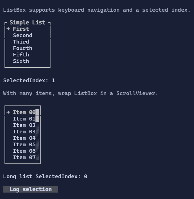
ListBox
ListBox<T> displays a scrollable list of items and supports selection/focus interaction.
Items
Items are data values. By default, the list resolves a DataTemplate<T> from the environment (DataTemplates) to render each item.
You can override this per instance via ItemTemplate.
new ListBox<string>()
    .Items(["First", "Second"]);
Selection and navigation
ListBox<T> is a single-selection control (SelectedIndex).
Keyboard:
Up/Down: move selectionPageUp/PageDown: jump by viewport heightHome/End: first/last item
Mouse:
- Click selects an item.
- Wheel moves the selection (and keeps it visible).
ListBox<T> is IScrollable, so it integrates with ScrollViewer scrollbars. Internally, the selection drives the
vertical offset to keep the selected item visible.
Custom item visuals
using XenoAtom.Terminal.UI.Templating;

new ListBox<string>()
    .Items(["First", "Second"])
    .ItemTemplate(new DataTemplate<string>(
        Display: static (DataTemplateValue<string> value, in DataTemplateContext _) =>
            new HStack(Symbols.ArrowRight, new TextBlock(() => value.GetValue())).Spacing(1),
        Editor: null));
Defaults
- Default alignment:
HorizontalAlignment = Align.Stretch,VerticalAlignment = Align.Stretch
Styling
ListBoxStyle controls:
- selected row style,
- optional selection marker glyph and spacing,
- per-row background filling (important when item visuals rely on style inheritance).
Defaults
- Default alignment:
HorizontalAlignment = Align.Stretch,VerticalAlignment = Align.Stretch
Styling
ListBoxStyle controls selection/hover colors and spacing.