OptionList
OptionList<T> is a single-choice list widget optimized for keyboard/mouse selection.
Basic usage
new OptionList<string>()
    .Items(["First", "Second"]);
Selection and activation
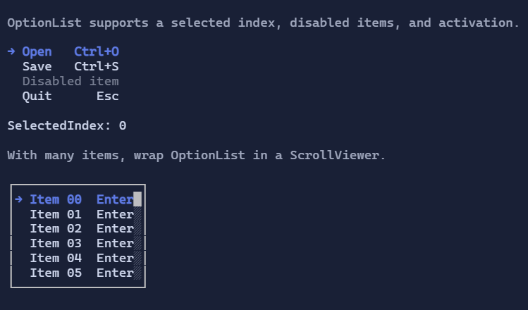
OptionList<T> is single-selection (SelectedIndex) and can raise activation events.
Keyboard:
Up/Down,PageUp/PageDown,Home/End: navigate the selectionEnter/Space: activate the selected item- Type-to-jump: typing letters jumps to the next matching item (via
ItemSearchText)
Mouse:
- Click selects an item.
- Click (optional) also activates when
ActivateOnClickis enabled. - Wheel moves selection.
Disabled items
Use ItemIsEnabled to disable certain rows (they remain visible but cannot be selected/activated):
new OptionList<string>()
    .Items(["Open", "Save", "Exit"])
    .ItemIsEnabled(item => item != "Save");
Templates
Like other list controls, OptionList<T> uses DataTemplate<T> to render items.
If you don’t set ItemTemplate, the template is resolved from the environment (DataTemplates).
Defaults
- Default alignment:
HorizontalAlignment = Align.Start,VerticalAlignment = Align.Start
Styling
OptionListStyle controls marker glyphs, spacing, hover/selection styles, and layout details.