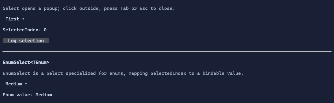
Select / Dropdown
Select<T> is a compact dropdown control. It opens a popup list and closes when:
- clicking outside
- pressing Tab or Escape
Basic usage
var select = new Select<string>()
    .Items(["First", "Second", "Third"]);
The selected value is SelectedIndex (single selection).
Templates
Select<T> uses a single ItemTemplate for:
- the selected value (collapsed state)
- items in the popup list (expanded state)
When ItemTemplate is empty, the control resolves a display template from the environment (DataTemplates).
If no template is found, it falls back to rendering value.ToString() in a TextBlock.
Custom item visuals
To render richer content, set ItemTemplate:
using XenoAtom.Terminal.UI.Templating;

var placements = new Select<PopupPlacement>()
    .Items([PopupPlacement.Below, PopupPlacement.Above, PopupPlacement.Right, PopupPlacement.Left])
    .ItemTemplate(new DataTemplate<PopupPlacement>(
        Display: static (DataTemplateValue<PopupPlacement> value, in DataTemplateContext _) =>
            new HStack(Symbols.ArrowRight, new TextBlock(() => value.GetValue().ToString())).Spacing(1),
        Editor: null));
Interaction
- Click to open/close the popup.
- When open, arrow keys move selection in the popup list.
Enterconfirms the current selection.Tab/Escapecloses the popup.
Defaults
- Default alignment:
HorizontalAlignment = Align.Start,VerticalAlignment = Align.Start
Styling
SelectStyle controls padding, arrow glyph, and colors for the collapsed control and the popup surface.