SelectionList
SelectionList<T> is a multi-select list widget (checkbox-style selection in-layout).
Basic usage
new SelectionList<string>()
    .AddItem("First")
    .AddItem("Second", isChecked: true);
Items and checked state
SelectionList<T> exposes:
Items: the list of itemsChecked: a parallelBindableList<bool>holding the checked state for each item (same index asItems)
This makes it easy to bind selection state to your own models:
var items = new[] { "A", "B", "C" };
var checkedState = new State<bool[]>([true, false, false]);
The control keeps Checked aligned with Items (same count). Missing entries default to false.
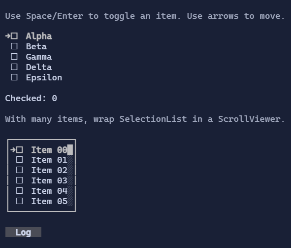
Navigation and selection
Keyboard:
Up/Down,PageUp/PageDown,Home/End: move the selection cursorSpace/Enter: toggle the selected itemCtrl+A: check allCtrl+I: invert all
Mouse:
- Click selects an item (and can toggle depending on style/interaction).
Templates
Like other list controls, items are rendered using DataTemplate<T>.
If you don’t set ItemTemplate, the template is resolved from the environment (DataTemplates).
Defaults
- Default alignment:
HorizontalAlignment = Align.Start,VerticalAlignment = Align.Start
Styling
SelectionListStyle controls glyphs, spacing, and selection visuals.